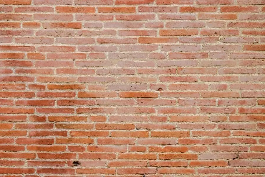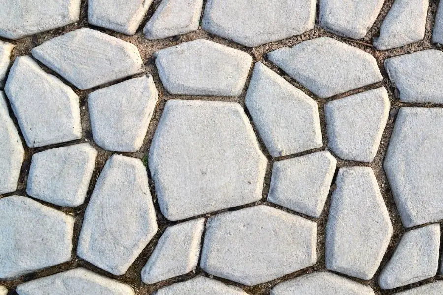
PBR texture maps are a set of images that each describe one property of a surface, such as its color, how rough it is, whether it’s metal, and its small bumps. A physically based rendering (PBR) shader reads them and works out how real light would hit that surface, so the material looks right under any lighting.
If you’ve downloaded a texture and got five or six files named “basecolor,” “normal,” “roughness” and so on, those are PBR maps. Below I go through what each map does, the difference between the metallic and specular workflows, which maps you actually need, what to do when a material looks wrong, and how to make your own maps from a photo.
| Map | What it describes | What it looks like |
|---|---|---|
| Base color (albedo) | The surface color, with no lighting | A flat-lit color image |
| Normal | Which way each pixel faces | Blue and purple |
| Height / displacement | How far each pixel is raised or sunk | Grayscale, 50% gray = no change |
| Roughness | How sharp or blurry reflections are | Grayscale, black = smooth |
| Metallic | Metal or not metal | Mostly pure black or white |
| Ambient occlusion | Soft shadows in creases and corners | Mostly white, gray in creases |
What does PBR mean?
PBR stands for physically based rendering. Instead of faking how a surface looks, you describe the material with values based on the real world, and the shader works out how light behaves on it. Older texturing meant painting highlights and shadows into the image. With PBR, the lights in your scene do that.
What properties does a PBR material describe?
Every material you’ll ever texture comes down to a few properties:
- Color. What our eyes see is the light a material scatters back. A banana looks yellow because it reflects yellow light and absorbs the rest.
- Reflectivity. How much light the surface reflects. This changes with the angle you look at it from.
- Microsurface. Tiny irregularities on the surface that blur or sharpen reflections.
- Relief. The bigger details like pores, cracks and scratches.
PBR maps are really just a way of feeding each of these properties to the renderer separately.
What is the difference between metals and non-metals in PBR?
Dielectrics are non-metals: plastic, wood, stone, concrete. When white light hits them, the reflection stays white. For most non-metals the F0 (reflectance looking straight at the surface, explained below) sits around 2% to 5%. So they reflect very little when you look at them head-on, but that number climbs toward 100% at grazing angles.
Conductors are metals like gold, copper and aluminum. Metals have no diffuse color. The color you see on a metal comes from its reflections, which is why gold gives white light a yellow tint. For most metals F0 is somewhere around 50% to 100%, so they’re very reflective even when you look straight at them. Worn or corroded metal is the exception: rust and oxidation reflect light more like a dielectric than a metal.
What is the Fresnel effect?
The Fresnel effect says that how much light a surface reflects depends on your viewing angle. Looking straight at a surface (0°) you get the least reflection. That value is called “Fresnel zero,” or F0. As your view gets closer to parallel with the surface, reflection goes up.
You’ve seen this on any lake. Stand on a dock and look straight down, and you can see the bottom because the water reflects very little. Look out toward the far shore and the same water looks almost like a mirror.
What are the PBR texture maps?
Each map in a PBR set handles one job. Here are the ones you’ll run into most often.
What is a base color (albedo) map?
The base color map holds the color of the surface: the brick in a brick texture, the grain pattern in wood. It can be a photo, a flat color or a gradient. You’ll also see it called diffuse or albedo. Some artists draw a line between them: to them, “albedo” means a base color with all shadows and highlights removed, so it holds pure color and no lighting information. For PBR that’s exactly what you want, because the renderer adds the lighting.
What is an ambient occlusion map?
There are three kinds of shadow to think about:
- Cast shadow: an object blocks the light and throws a shadow onto something else.
- Form shadow: the side of an object turned away from the light gets darker, which shows its shape.
- Ambient occlusion (AO): the soft darkening you get in corners, creases and anywhere two surfaces meet or sit close together.
An AO map is mostly white, with the soft contact shadows in shades of gray and black depending on how strong they are. It adds a lot of depth for very little cost.
What is a height map?
A height map is grayscale. Middle gray (50%) means “no change.” Lighter values push the surface up, darker values push it down, and the further a value is from middle gray, the bigger the bump or dent. Height maps are great for scratches, cracks, terrain and anything else with depth. The point is to save resources: modeling all that detail with real geometry would take a lot more computing power, especially in real time.
What is a normal map?
A normal map looks nothing like a height map. It’s full of blues, purples and reds instead of grays. A height map tells the renderer “up or down.” A normal map tells it which way each pixel of the surface is facing.
Quick refresher if you haven’t run into the term: a normal is an arrow pointing straight out from a face, perpendicular to it. It shows which way that face is oriented in the 3D model. A normal map stores a direction like that for every pixel, which is why it can fake angled detail so convincingly.
There are two flavors:
- OpenGL, used by programs such as Blender
- DirectX, used by Unreal Engine, among others
The only difference is that the green channel is flipped. If you have one and need the other, open the map in Photoshop (or any editor with channels), go to the Channels panel, select only the green channel and press Ctrl+I to invert it. Then turn all the channels back on and save.
You can use a normal map and a height map together on the same material.
What is a roughness map?
Roughness is the easiest map to read. Black (0) means perfectly smooth, so the surface gives sharp, mirror-like reflections. White (1) means very rough, so reflections spread out until they barely show. Everything in between is a matter of degree. Roughness maps are where a lot of the realism comes from: small variations let you show fingerprints on glass, smudges on a phone screen or wet patches on metal.
What is a metallic map?
The metallic map is also black and white. Black means dielectric (non-metal) and white means metal. In the real world a surface is either metal or it isn’t, so most of this map should be pure black or pure white. You can use gray values for transitions like dirt over metal, but keep them to a minimum.
Those are the main maps. There are others, like vector displacement maps, but you can make good materials with just these.
Metallic vs specular: which PBR workflow should you use?
“Workflow” here means which set of maps you use to describe the material and how they combine. The choice usually depends on your software, your art style and what the project needs. Either one can give you great results. What matters is picking one and sticking with it for the whole project, so everything looks consistent.
Specular/glossiness workflow
The specular workflow has been around a long time and plenty of offline renderers still use it. The main maps are diffuse, specular and glossiness. You control F0 directly, which gives you a lot of freedom. The downside is that it’s less intuitive, and if you pick the wrong values it’s easy to break energy conservation (more on that below).
Pros
- Reflectance and diffuse live in two separate maps, which feels familiar if you come from traditional shaders.
- You get more control over reflectivity on non-metals, including colored reflections.
Cons
- Because you choose the values yourself, it’s easy to enter unrealistic ones.
- It uses more texture memory than the metallic workflow.
Metallic/roughness workflow
The metallic (or metal/roughness) workflow is easier to work with because the shader takes care of the reflectance values and keeps them in a realistic range. A lot of game engines and offline renderers use it. The main maps are base color, roughness and metallic. If you’re new to PBR, start here.
You can add normal, height and AO maps on top of either workflow.
Pros
- The base color map defines the visible color no matter what the material is, which is easy to understand.
- Materials are split into metals and non-metals, so it’s hard to author something physically impossible.
- It uses less texture memory than the specular workflow.
Cons
- Where metal meets non-metal, you can get thin white lines (edge artifacts).
- You have less control over reflectivity on non-metals.
- If you don’t understand the metallic map, it’s easy to fill it with in-between values that don’t make sense and confuse the shader.
What about stylized textures?
Lots of games skip both workflows because their art is stylized. The lighting is painted straight into the color texture, so the material doesn’t need real reflections. That isn’t PBR, since it’s not trying to be physically accurate, but it’s a valid choice for that kind of look.
Which PBR maps do I actually need?
For most materials in the metallic workflow, start with these:
- Base color. Always.
- Roughness. This does more for realism than any other map after base color.
- Normal. For surface detail like grain, pores and scratches.
- Metallic. Only if part of the material is metal. For wood, stone, brick or fabric you can skip the map and set metallic to 0.
Add ambient occlusion if your renderer doesn’t calculate it well on its own, and height/displacement when the detail needs to change the silhouette, like bricks sticking out of mortar or deep cracks. Height is more expensive to render, so use it where it shows.
How do I plug PBR maps into Blender or other programs?
The names change from program to program, but the idea is the same. In Blender’s Principled BSDF shader, for example:
- Base color goes into Base Color.
- Roughness goes into Roughness, and metallic into Metallic. Set those image nodes to Non-Color.
- The normal map goes through a Normal Map node into Normal, also set to Non-Color.
- Height goes through a Displacement node into the material output.
The one setting people miss is color space. Base color is a color image (sRGB). Every other map is data, so mark it as non-color or linear. If you don’t, roughness and normals come out wrong.
Why does my PBR material look wrong?
It looks like plastic. The roughness is too uniform. Real surfaces have variation: smudges, wear, dust. Add some variation in the roughness map.
The bumps go the wrong way. The normal map is the wrong type (OpenGL vs DirectX). Flip the green channel as described above.
Everything looks too shiny or too dull. Check that the roughness map is set to non-color and isn’t inverted. Some texture sets give you a gloss map instead, which is roughness inverted.
The color looks washed out or too dark. Shadows or highlights are baked into the base color, or the base color is set to non-color by mistake. Use a flat-lit base color.
Metal looks black. Metal gets its look from reflections. In an empty scene with nothing to reflect, metal looks dark. Add an HDRI environment.
The texture repeats in an obvious pattern. The source isn’t seamless. See how to make a seamless texture in Photoshop.
Why use PBR textures at all?
Before PBR, every render engine had its own way of doing things. Moving a model from Blender to Unity, for example, meant rebuilding shaders and redoing work. PBR removed a lot of those steps and became something close to an industry standard, so it’s worth learning even if you also use older techniques.
What you get out of it:
- Less guesswork. The math is based on real physics, so you’re not inventing specular values by eye.
- Assets that look right in any lighting, not just the scene you built them in.
- Consistent results across a team, even when different people make the textures.
Does PBR take away artistic control?
Since hardware can now imitate the physics of light pretty closely, we have to think about texture maps differently. The old diffuse and specular maps were workarounds for faking how light hits a surface. In PBR, the shader handles the physics through the BRDF (bidirectional reflectance distribution function) and energy conservation. Your job is to give it maps with physically sensible values.
That doesn’t mean physics takes over. The artist still gives an object its character and tells its story through the details. Disney’s physically based shading model is a good example: it was designed to follow principles, not to be a strict physics simulation, so it stays artist-friendly. Learn the rules and follow them, but don’t let them stop you from making stylized work if that’s what you want.
How does light make us see a material?
We see objects through two things: reflection and diffusion.
Reflection is light bouncing straight off a surface. On a flat, smooth surface it behaves like a mirror. “Specular” actually comes from the Latin word for mirror.
Diffusion is what happens to the light that doesn’t bounce straight off. Some gets absorbed, some scatters inside the material, and some of that scattered light comes back out where our eyes or a camera can catch it. How much of each wavelength gets absorbed or scattered decides an object’s color. If a surface absorbs most of the light and scatters blue, it looks blue.
Transparency and translucency are more complicated forms of this and depend on the object’s shape and thickness, so they need their own shaders. A translucent material is thin enough that light scattered inside it comes out the back side. When there’s almost no scattering at all, light passes straight through and the object is transparent.
What is wrong with old (non-PBR) textures?
If you’re updating older assets, these are the usual problems:
- The diffuse is too dark. It probably looked fine under one specific lighting setup but falls apart in modern ones.
- Ambient occlusion and cavity detail are baked into both the diffuse and specular maps. A modern shader expects AO as a separate input. Large-scale AO also shouldn’t go into the specular, because blocked light isn’t the same thing as a less reflective surface.
- Lighting gradients are baked into the diffuse and specular maps.
- There’s no gloss map, so the specular map is doing double duty: describing the microsurface and the reflectivity at the same time.
- Specular values were set by eye instead of from real material data. The result is things like black-painted metal that’s too reflective and slightly yellow, and rubber or plastic that doesn’t reflect enough.
How do you convert old textures to PBR?
Here’s the order I’d work in:
- Strip all baked lighting and gradients out of the diffuse (albedo) and specular maps.
- Move AO and cavity detail into their own textures and plug them into the matching shader slots.
- Bring the diffuse values back into a realistic range.
- Split the old specular content into a specular map and a gloss map.
- Set base values that match each material’s microsurface, and move the surface variation from the old specular map into the new gloss map.
- If there’s already a gloss map, check that its values make sense.
Think about what’s physically there. On a rifle, for example, bare metal would be smoother and glossier than a matte coating, and a scratch through glossy paint might show rougher primer underneath.
What are common PBR myths?
- “You have to use a metalness map.” No. A material built with specular maps is just as much PBR.
- “Load old textures into a PBR shader and they’ll be physically accurate.” They won’t. You only get accurate results from content authored with sensible values.
- “Diffuse and albedo are different things.” In everyday use they mean the same thing, and you’ll see the names used interchangeably.
What changed with modern shaders?
Lighting got a lot better. We now have dynamic lights that cast realistic shadows and image-based lighting that gives accurate diffuse light and reflections. That means you no longer paint reflections, lighting or shadows into a texture. Instead of baking for one lighting setup, you focus on describing the material.
Linear-space rendering also helps. You no longer have to tint the specular map opposite to the diffuse to get a neutral white highlight, and because the microsurface handles energy conservation, you don’t need to darken rough areas and brighten glossy ones by hand. In practice, specular maps for a given material end up close to a flat value, and most of the surface variation lives in the roughness or gloss map.
What is energy conservation in PBR?
Energy can’t be created or destroyed, only changed from one form to another. For materials, that means a surface can never send out more light than it receives. The more light a material reflects, the less it can diffuse, and the other way around. Shiny materials have weaker diffuse; dull materials have stronger diffuse. PBR shaders enforce this automatically, and it’s a big reason PBR materials hold up under any lighting.
The short version: PBR gives you a more accurate picture of how a material reacts to light than older real-time models, and because material and lighting are kept separate, your assets look right wherever you put them.
How do you make PBR textures from a photo?
If you have a regular JPEG photo, you can turn it into a basic PBR set for free with NormalMap-Online. Load your image, adjust the sliders until the preview looks right, and download the maps. It takes a few minutes.
A few things make a big difference to the result:
- Shoot in flat, even light. An overcast day is ideal. Strong shadows in the photo end up baked into your base color.
- Shoot straight on, not at an angle, so the texture isn’t distorted.
- Make the photo seamless first if the material will repeat on a big surface. My Photoshop seamless texture tutorial shows how.
- Check the maps in your renderer, not just in the tool’s preview, and adjust strength there.
Generated maps are a guess based on light and dark in the photo, so they work best for fairly flat materials like stone, brick, concrete and stucco. For more control, people use programs like Substance or Blender to bake or paint maps. If you’d rather start from a finished texture, I have some free seamless textures you can use, and you can bring them into Revit with this custom material method.
Once the materials look right, a scene can still feel empty, so here’s how I add custom people to my renders for free.